We all have our favorite local spots that we find ourselves visiting regularly. But do we ever stop to think why a place became our favorite? Sure, the most obvious reason is likely that this specific place offers something that you love and perhaps can’t get anywhere else. However, if we’re being realistic, there are plenty of businesses out there doing the same thing. For example, I am loyal to my favorite local sandwich shop. My area has a plethora of sandwich shops, so much so that it is widely debated which one is the best, and the locals are very passionate about it. Whenever I’ve tried a sandwich from one of the other shops to choose from, it’s usually quite comparable taste-wise. So why do I remain loyal to one? It is because they branded themselves in a way that stuck with me and evoked an emotion that pulls me into that shop whenever I’m craving a sandwich. That emotion is something that comes from how the shop is branded.
What is a Brand?
Cath Caldwell’s Graphic Design For Everyone defines a brand as “a set of characteristics that helps an audience differentiate a business, product, service, or project from its competitors.” Caldwell goes into depth on how to approach a project for a brand, whether you are starting from scratch or revitalizing what already exists. Arguably the most important part of a brand is its logo.
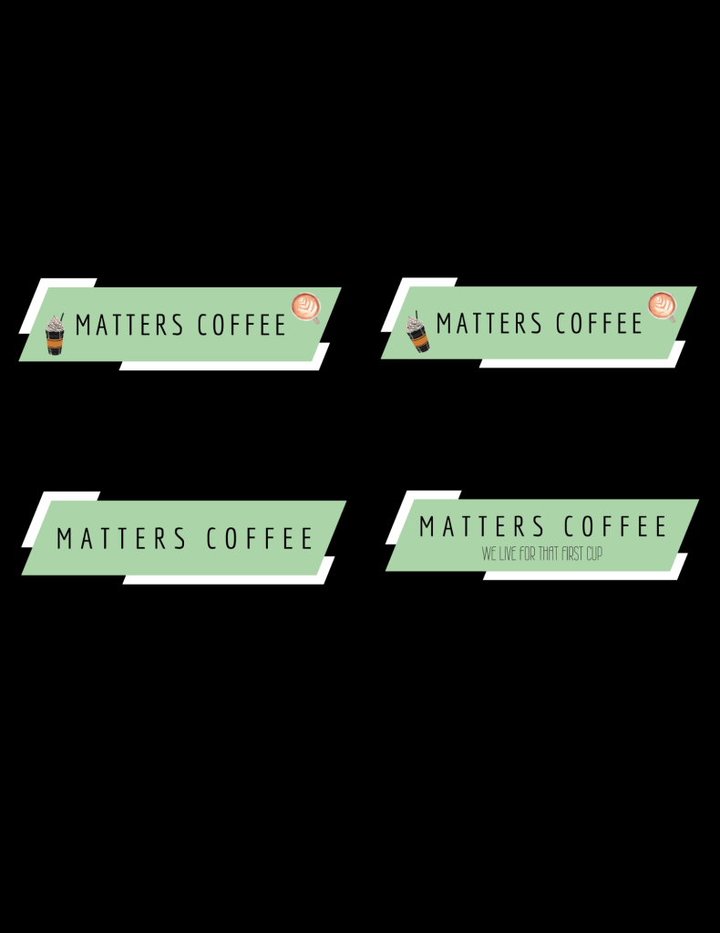
Caldwell explains that “when you design a logo, you are aiming to create a memorable visual symbol for your business or service. The graphic visual language you use tells the story of your brand in its meaning, structure and visual form.” When thinking about this, I embarked on a journey to rebrand a local coffee shop.
My Project: Matters Coffee
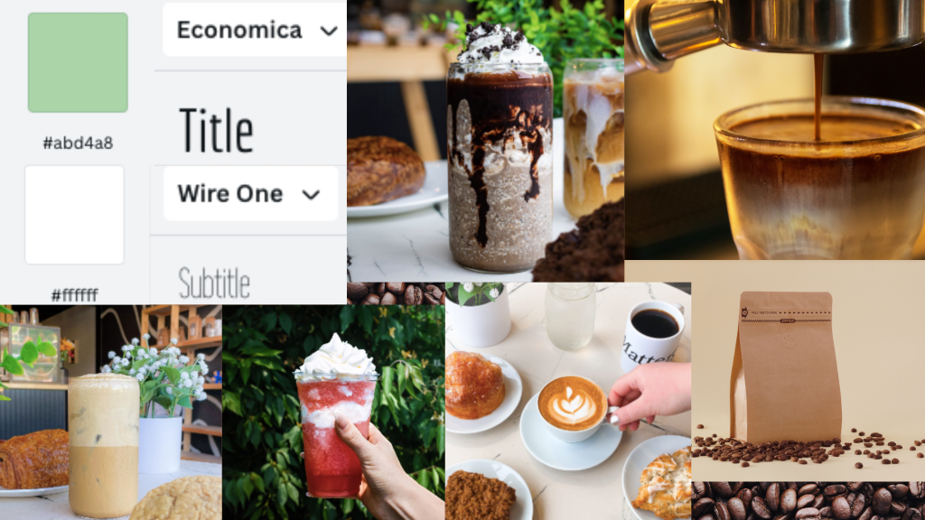
I applied the concepts I learned this week to create a brand plan with new logo options for Matters Coffee. This business is a new coffee shop in my area. I began by conducting research using primary and secondary methods such as interviews, surveys, and looking at the business’s website and social media profiles. In doing so I established the current aims of the business, its personality, and its audience. I used my research to put together a verbal and visual plan for Matters Coffee.
One thing my area has lacked in coffee shops is the addition of unique, specialty drinks to the classic coffee selection. This is something that Matters Coffee does well, so I knew it was crucial to make it a key component of the branding. I included coffee graphics in some of my designs that were reminiscent of the specialty drinks they’re known for.
When looking around the shop, I saw a lot of plants paired with a sleek, modern aesthetic. I pulled inspiration from these attributes to come up with a new color scheme and logo concepts. The shade of green I chose represents the comfort that the greenery in the shop gives, while also being a color I associate with the shop’s aesthetic. It’s also a nod to the shop’s value of sustainability. My choice of shapes and fonts is simple yet elegant at the same time, which represents how the shop’s interior looks.
My logos and mood board evoke the same emotion that I get when I’m in Matters Coffee. This paired with design choices that represent what makes this shop different from others in the area is what branding is all about. These tools allow future customers to understand exactly what kind of place they’re walking into and why they would want to keep coming back. Just like how I keep coming back to my favorite sandwich shop.


Leave a comment