
I used the Datawrapper tool as a way to practice data visualization and to determine the best ways to visualize certain pieces of data. In Datawrapper, I created three types of maps as well as a chart.
Maps
I created three different types of maps, including a choropleth map, a symbol map, and a locator map. According to Datawrapper, a choropleth map is great for showing regional patterns. A symbol map shows symbols that are sized and colored based on the data. Locator maps are ideal for showing specifically where something is located or where an event took place.
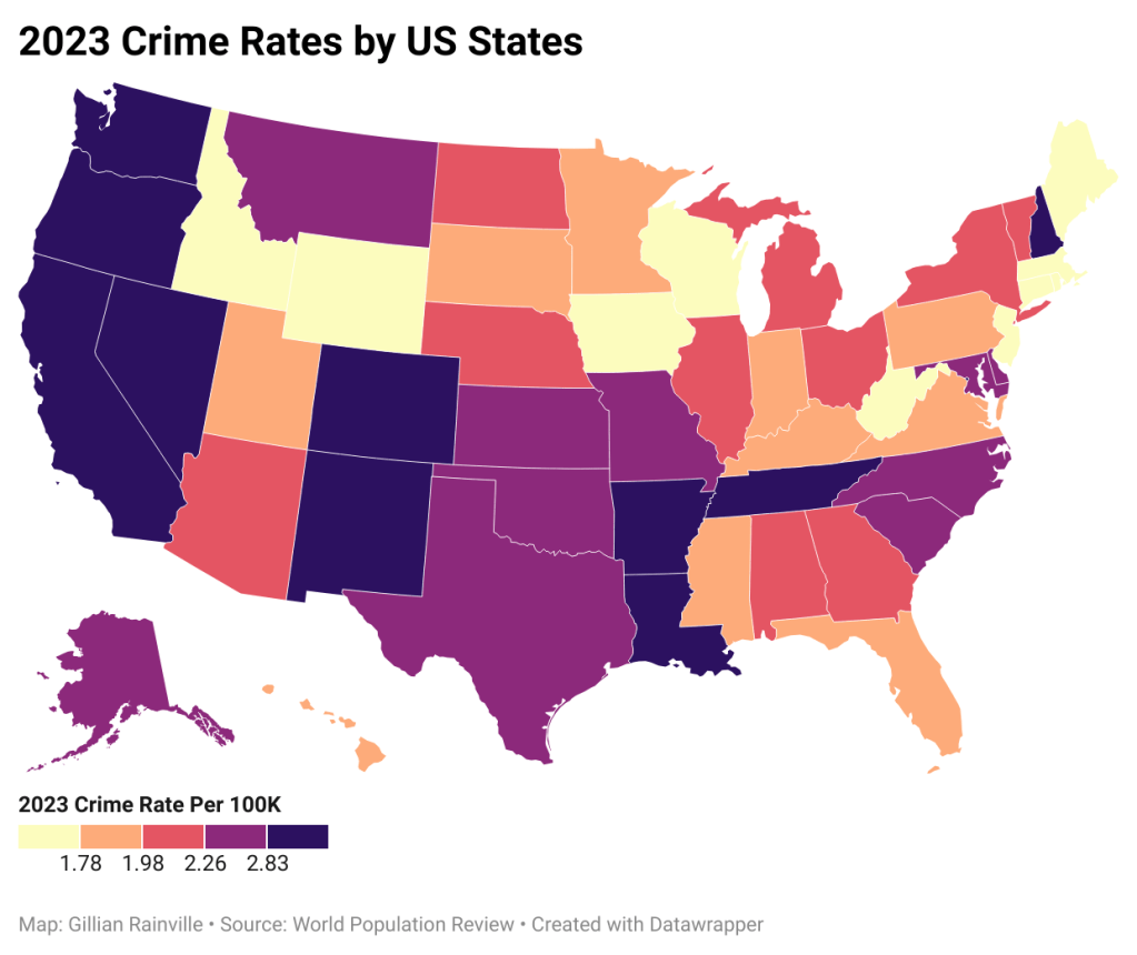
The choropleth map I designed shows the US Crime Rates in 2023 by state. The colors allow a viewer to quickly see which areas had the most and the least crime. I chose a color scheme that ranged from light to dark. This helps viewers see right away where the lowest and highest values are. I made sure to include a color legend as well to further the viewer’s understanding of the different colors.
The symbol map I made reveals the United States’ COVID-19 cumulative positive cases and cumulative deaths by state. I thought this dataset worked well for this type of map because there are two important pieces of data for each state, and symbol maps are best to show data through both size and color. In this case, the size represents the cumulative number of positive cases, and the color represents the cumulative number of deaths. Viewers can easily see the correlation between positive cases and deaths, because the bigger the circle, the darker the color.

The locator map I constructed displays all the Disney Theme Park locations in the world. Viewers can easily see where all six parks are located. A challenge I encountered when making this map was ensuring all of the words were visible. Some of the locations are nearby on the map, causing some of the park names to overlap. I had to alter where some of the names were placed so that viewers didn’t have trouble identifying which park was which.
Chart
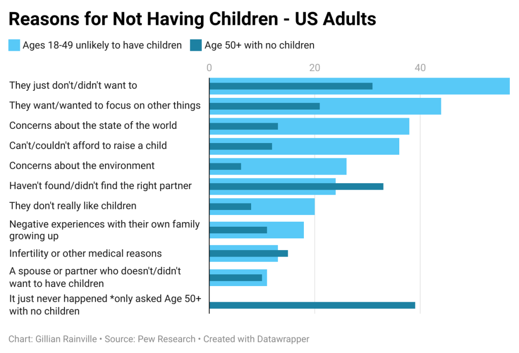
I found a dataset on US Adults’ reasons for not having children. A chart was the right decision, and I knew some type of bar chart would be best, considering the amount of data I had. This dataset included 11 different reasons why adults aren’t having children, and the responses are split into two groups: Ages 18-49 unlikely to have children, and Age 50+ with no children. I decided bullet bars were the best option. I could clearly list each reason, while showing both age groups’ responses in a way that was easy for the viewer to understand through color. A color legend was included as well to help the viewers read the chart.


Leave a comment