Everything in our lives is data. How many minutes we sleep, the number of interactions we have in a day, or how many glasses of water we drink–it all becomes data. Does any of this data actually matter? Of course it does!
Giorgia Lupi and Stefanie Posavec explain the beauty of collecting data and the ways to visualize it in their book Observe Collect Draw!: A Visual Journal. They describe data as being like taking a picture of a small moment in time. All of your individual data is a snapshot of the larger image that is your life. When you start paying attention to what may seem like minute details, “you can encourage yourself to notice more closely the life unfolding around you, and become more in-tune with your world and yourself in the process.”
My Music Listening Data
In an effort to be more in tune with myself, I decided to start paying attention to one of my favorite things that I do–listening to music. I love music and I listen to it nearly every day. Even when I’m really busy, I usually find time in my day for it.
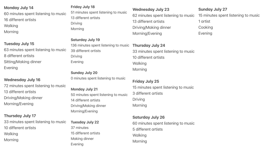
Lupi and Posavec explain that to see the world like a data collector, you need to start with a question. My initial question was: What are my music listening habits? The data above shows what I tracked for two weeks. I wrote down the number of minutes spent listening to music, the number of artists I listened to, what I was doing while listening, and the time of day.
In this process, it’s also important to analyze the data and notice what patterns are emerging. The first thing I noticed is that I always listen either in the morning or in the evening. The next thing I noticed is that I’m usually walking, driving, or cooking while listening to music. This makes sense with my current lifestyle as a student who is also working. I don’t have much time to listen to music during the day while I’m doing work, so I typically include it as part of my morning walk, a drive, or to unwind at the end of the day while I make dinner. The only day in these two weeks that I didn’t listen to music was a Sunday. This also makes sense with my current lifestyle as a student because I had assignments due that evening, so I didn’t go on a morning walk, and I ordered dinner rather than cooking to save time.
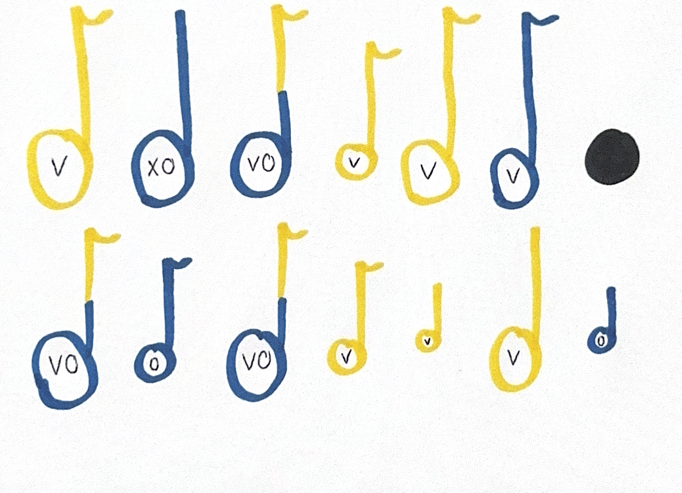
Visualizing My Data
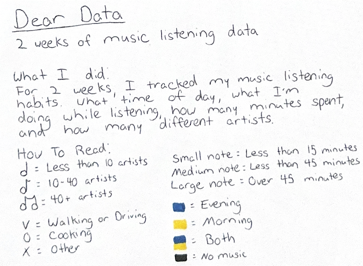
Lupi and Posavec discuss how you can create your own visual vocabulary through tactics like color variation and symbol variation. When considering my data, I knew I had four main elements to express in my visual. I chose different music notes with different sizes to represent the number of artists and the number of minutes, and I used color to represent the time of day I listened to music. Symbol variation helped me show what I was doing while listening to music. Below is the full visual of my data, along with the legend needed to read it.


Leave a comment