Information should be understood when it’s presented to your audience, and in order to do so, it must be presented in the right way. This is why it’s crucial to decide the right type of information visual to use. Making this decision starts with understanding your goal and what kind of information you’re presenting.
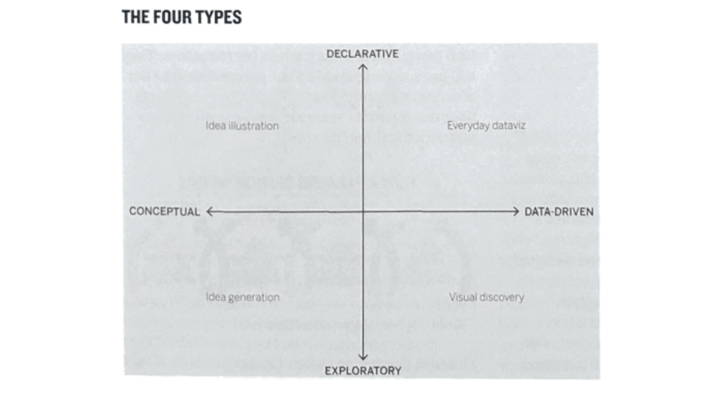
The Four Types of Information Visuals
There are four types of information visuals. Conceptual-declarative, conceptual-exploratory, data-driven-declarative, and data-driven-exploratory. First, you must ask yourself, is the information conceptual or data-driven? Scott Berinato explains in Good Charts that when it’s conceptual, the focus is on your ideas and the goal is to simplify and teach them. When it’s data-driven, the focus is on your statistics, and the goal is to inform and enlighten. Berinato states, “notice that the question is about the information itself, not the forms that might ultimately be used to show it.”
Next, you need to decide if you’re presenting the information in a way that is declarative or exploratory. Berinato says when it’s declarative, the focus is on documenting and designing, and the goal is to affirm. When it’s exploratory, the focus is prototyping, iterating, interacting, and automating. The goal is to corroborate and discover.
When To Use Each Information Visual
Scott Berinato explains when it is best to use each type of information visual. Conceptual-declarative is used when you’re explaining a known idea or process, but not actual data. It can be used to present theories, systems, or strategies. Conceptual-exploratory is used when you’re brainstorming an abstract idea and is best done in the planning stage before collecting data. Data-driven-declarative is best when you’re presenting evidence using actual data. This is best when you’re showing trends in performance to help make decisions. Data-driven-exploratory is best to use when you’ve collected data, but you’re exploring to discover what patterns your data shows and what questions it answers.
Examples
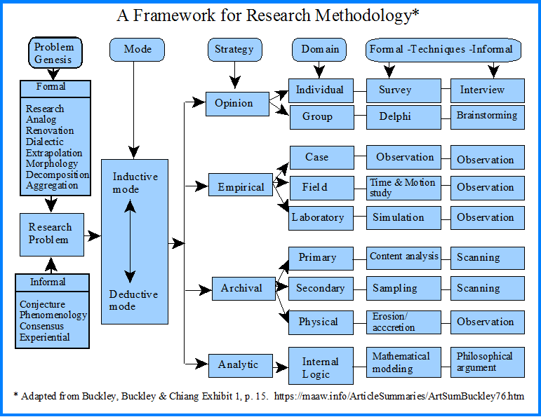
This first example from MAAW is conceptual-declarative because it shows a framework of research methodology, using an idea rather than data. It’s effective because it clearly explains the process of researching and what strategies to use.
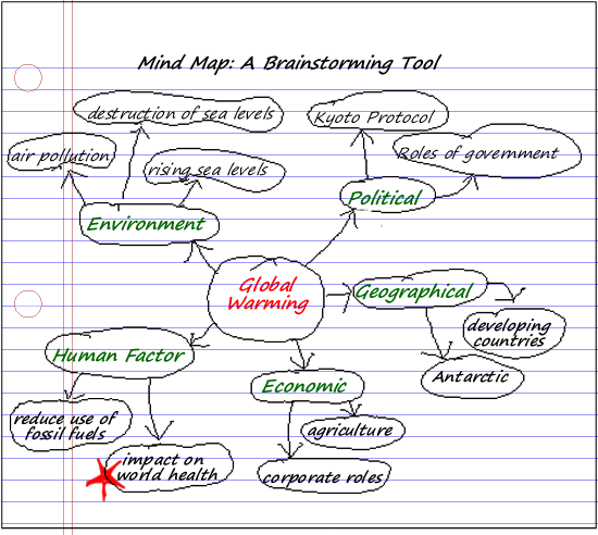
This second example from Clark College Libraries is conceptual-exploratory because it shows the process of brainstorming the concept of global warming and its causes. This would be an effective way to start planning your ideas before collecting data on the causes of global warming.
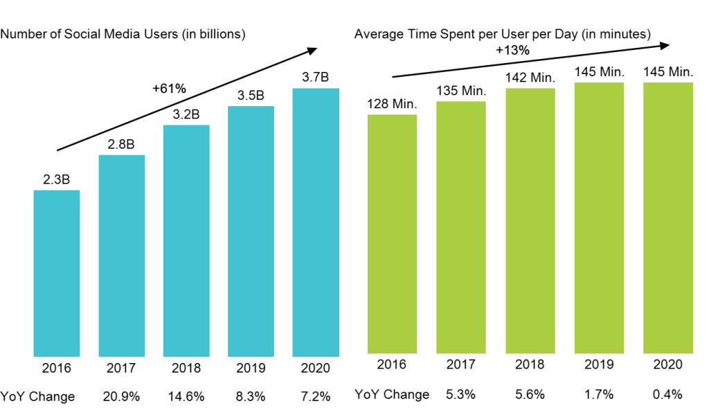
This next example from Mekko Graphics is data-driven-declarative. The bar charts show data on social media usage over the years. We learn from these charts that the number of social media users has increased over the years, as well as the amount of time spent on social media. It is effective because we can learn from this that social media usage is, in fact, growing.
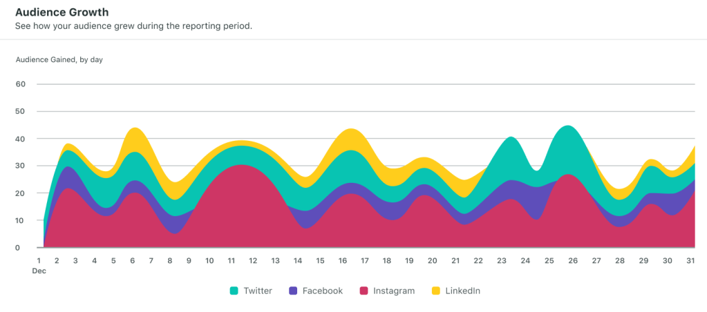
Lastly, this example from Sprout Social is data-driven-exploratory. The chart shows audience growth for a brand on its social media platforms. The data shows that their audience growth fluctuates daily, and this information can be used to explore why this pattern is occurring. This is effective for the brand to discover what changes need to be made in order to see a steady rise in audience growth.


Leave a comment