
Data visualization plays an important role in how we advance as a society in many aspects. Heavy.AI defines data visualization as “a graphical representation of data. It presents data as an image or graphic to make it easier to identify patterns and understand difficult concepts. Technology allows users to interact with the data by changing the parameters to see more detail and create new insights.” Data visualization is crucial in presenting information efficiently and effectively to help us better understand what is being shown, which leads us to make important decisions within society.
The Pros and Cons of Technological Advances
The technological advances in data visualization over the years come with both pros and cons. One con of technological advances is that charts may become more confusing as they become more intricate and include more data. On the other hand, a benefit of technological advances is that charts can be understood more clearly because we have the technology to create them more effectively. Some handwritten charts from the past might be harder to understand but now with the ability to digitize them, they can be clearer. Michael Friendly explains in “A Brief History of Data Visualization” that the ability to produce complex graphs is also a pro because it allows researchers to see a lot of data at once. Friendly also discusses that another pro is the positive effects that data visualization has on society because it allows us to make informed decisions on politics and public health issues.
What Makes a Good Chart?
In my opinion, what makes a good chart is clarity in all aspects. I should be able to understand what the chart is showing and what the data means without too much effort. Heavy.AI explains that visualizing data improves decision-making, so I should be able to make quick decisions from a good chart.
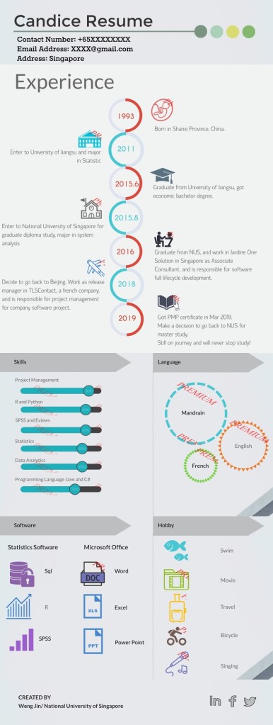
The chart below shows a resume done in a unique way that utilizes data visualization. What I like about this is that although there is a lot of different information, I can immediately understand what I’m looking at. Upon first glance, I understand that this is a resume that includes a timeline of experience along with skills. As I continue to examine the chart, I can quickly see the specifics of what Candace has done in her studies and professional life, as well as her personal life. I can imagine that viewing resumes all day can get boring, and Candance’s would certainly stand out to a future employer. Not only does it stand out, but it’s enjoyable to read and visually appealing.


Leave a comment