
All designs begin with a blank sheet, whether it’s digital or physical. So, where exactly should a designer begin? That’s where grids and composition comes in. Graphic Design For Everyone by Cath Caldwell defines grids as “a structure that sits invisibly underneath your layout and helps you arrange elements in an organized way.” If you use Adobe InDesign, for example, grids and guides are used to determine where your elements should be placed in order to be organized. The grids will go away when you export your project, but the composition of your elements will not. For this reason, grids are important to use when designing.
Email Newsletter
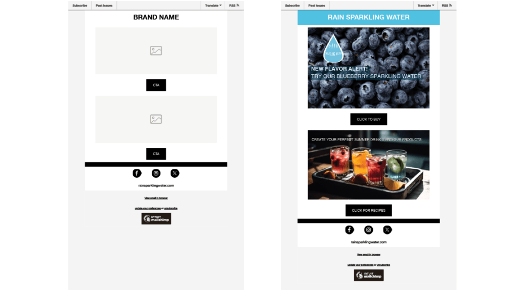
To practice grids and composition, I revisited my fictional brand, Rain Sparkling Water. My first task was to create an email newsletter, along with its wireframe. Mailchimp, a platform with templates for email newsletters, came in handy for this project. I chose a single-column grid for this design, which Caldwell defines as “the simplest grid…generally used for setting text-heavy documents.” While this email newsletter isn’t quite a text-heavy document, it is something that I want to be straight to the point. Caldwell explains that “a digital newsletter is an effective way to communicate with an audience. However, their popularity means that a newsletter must work hard to get noticed in a crammed inbox and tempt the reader to engage.” I think in this case, the single-column grid allows the important information to be displayed immediately and therefore the reader can engage faster. In this newsletter, I announced the addition of a new flavor, as well as a drink recipe guide that includes Rain Sparkling Waters. Below each announcement, I included the necessary call-to-action buttons that allow the readers to engage. These tools come together to create a successful email newsletter.
Website Design
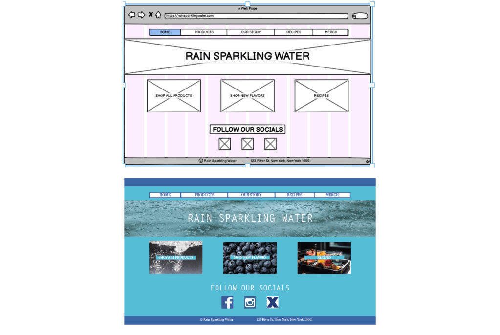
My next project for Rain Sparkling Water revolved around the website. I created a design, as well as the wireframe. I used the online software, Balsamiq, to create the wireframe. To start I chose a 12-column grid, which Caldwell explains is “a good choice for web design it gives so much flexibility…altering as the screen width changes on different devices.” Using the grid to determine the best composition, I placed the various elements I needed into my wireframe. My main aims for this website were easy access to purchase the products, as well as inspiration for ways to use them. I used the main section of the website to link to shopping pages, as well as the recipe page. This covers the same information from the email newsletter, so customers who navigate to the website and want to find those same pages can easily do so.
In conclusion, using grids is key to creating the right composition in your designs. The more organized your designs are, the more digestible it will be for your viewers. The softwares I used for these projects, MailChimp and Balsamiq, helped in determining the best way to set up all of the important information. This process left me with well-organized designs that got my message across to my viewers.

 Gillian Rainville | QU Graduate Blog
Leave a comment