When you’re walking down the street and you pass a poster or you’re handed a flyer, it’s often not long before you know what event is being advertised. This is because the information is structured in a way that allows you to see what is important, followed by additional details. The designer who created what you’re looking at did this intentionally, using concepts of basic layout.
I worked on some projects of my own this week, practicing what I learned about basic layout. Summerfest is an event in Croton-on-Hudson, New York that takes place every year. I used this event as inspiration to create designs.
Event Poster
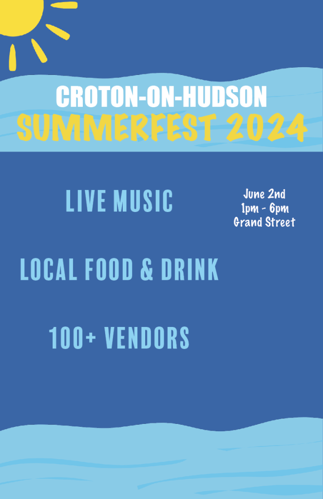
When designing the event poster, I took into account the white space-which doesn’t have to be white by the way. In Graphic Design For Everyone, Cath Caldwell defines white space as “the room that is deliberately left within blocks of text, between design elements or around the margins of a page.” The elements used in my poster are all spaced apart to allow clarity. When pieces of a design are too close together, it could become cluttered and therefore harder for the viewer to digest important information. When thinking about white space, it’s best to approach it with a “less is more” attitude.
Typography can be used in designs to create a certain hierarchy. I focused on this concept when creating my event poster. I ranked my text by placing what is most important on top. In this case, that is the name of the event itself, and the secondary information that includes more details follows. I also use the size of text to achieve hierarchy. The name of the event is the biggest text, and even within that there is a hierarchy. The name of the town is slightly smaller than the actual event taking place. Then, the information that describes what will take place at the event is the next biggest size, and following that is the time and place of the event. Weight is used as well, as shown by the bold letters used for the event title. The rest of the information is not quite as bold. Although everything on the poster is necessary to know for someone who plans to attend the event, the idea is to catch their eye with what is most important. Imagine seeing a poster that says “1pm-6pm” written in big, bold letters on top and then “Croton-on-Hudson Summerfest 2024” in small letters on the bottom. You might not even get to the smaller letters because just seeing “1pm-6pm” probably won’t entice you.
Event Flyer
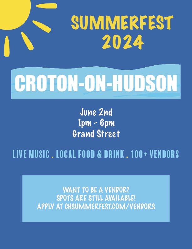
My event flyer for this event is another example of these layout concepts. The information is all spaced in a way that allows the viewer to see everything without getting overwhelmed by clutter. I used typography to create a hierarchy in this design as well. The event itself is the biggest type, followed by the information regarding when and where it takes place, as well as what will be offered. The smallest text is information on being a vendor, which doesn’t apply to all viewers and doesn’t affect the overall event. If these were all sized differently, it wouldn’t make sense. Using the concepts of basic layout, your designs will get the right message across.


Leave a comment