When you see the color yellow, what comes to mind? Probably something cheerful or happy. What about the color red? Perhaps love, passion, or even danger. Every color you see evokes some sort of emotion. We all experience the psychology of color everyday, even if we’re not aware of it. When choosing colors for a design, it is crucial to keep the psychology of color in mind. In “Color Psychology: How To Use it in Marketing and Branding”, Bailey Maybray states that “color psychology — leveraging colors to produce an effect — can influence 85% of customers’ purchasing decisions.” A designer always wants to ensure that their design is giving the correct message.
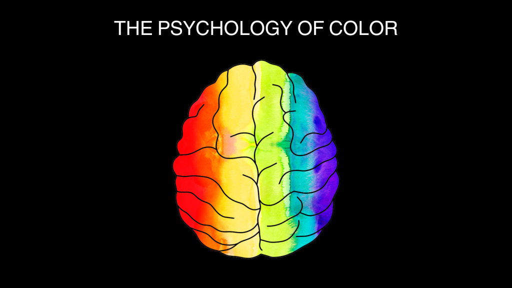
HOW COLORS MAKE US FEEL
I think of the psychology of color as split into two categories. The first being how a color actually makes us feel. When considering this side of color psychology, you want to research how different colors affect the human brain. This goes beyond what we associate a color with based on societal norms. In “How Colors Affect Brain Functioning,” Dr. Barbara Koltuska-Haskin explains that “color is an important stimulus for the brain because 80 percent of our sensory impressions come from our visual system.” Color can play a big part in affecting your overall mood. In Graphic Design for Everyone, Cath Caldwell explains that color creates a powerful and emotional reaction from humans. “Research has shown that there is consistency in the responses people have to colors; for example, warmer colors (red, orange, yellow) generally stimulate, while cooler colors (blue, indigo, violet) are calming.” This is important to keep in mind when choosing a color palette for your design. Consider how you want your audience to feel and then pick colors based on that.
HOW WE ASSOCIATE COLORS
The second category of color psychology is what our brain associates certain colors with. This is similar to how a color makes us feel, but it’s slightly different because it’s related to associations we have established in society with color. For example, I tend to stay away from using red and green together because it’s a color combination strongly associated with Christmas. Another color association that comes to mind is purple, which usually represents wealth. This is because “in the Roman Empire, high-ranking officials wore Tyrian purple, which cost more than gold at the time. Queen Elizabeth I even banned anyone outside the royal family from wearing purple.” Pink and red on Valentine’s Day, yellow for a cheerful, summer celebration, and green for Earth Day; all are different color associations to keep in mind when choosing a color palette for a design.
HOW I APPLIED THIS CONCEPT
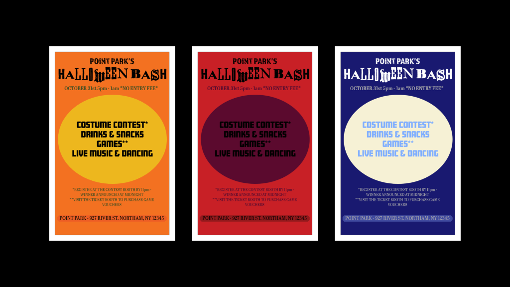
I put my knowledge of color psychology to the test when designing a poster for a Halloween party. Due to Halloween being the main subject, I focused on color associations. My first poster went with the classic Halloween colors, orange and black. I used yellow and green as well, because I often see cartoon jack-o-lanterns that include a green stem and yellow to represent the candle seen through the cutouts. The second poster uses red and purple because those colors are often associated with vampires, blood, and other Halloween elements, especially when used in this context. The third poster is inspired by midnight, which is also strongly associated with Halloween. I used a dark blue to represent the night sky and a light, cream color to look like the moon. If I had to choose, I would likely stick with the first poster because it’s the most classic, but the others are also fitting while standing out.
Color psychology is a very interesting concept. It is one that all designers should take the time to educate themselves on. When used correctly, you can get the exact reaction you want from your audience.
WORKS CITED
Caldwell, C. (2019). Color. In Graphic Design For Everyone: Understanding the Building Blocks So You Can Do It Yourself (pp. 72–73). essay, Dorling Kindersley Limited.
Koltuska-Haskin, B. (2023). How Colors Affect Brain Functioning. Psychology Today. https://www.psychologytoday.com/us/blog/how-my-brain-works/202301/how-colors-affect-brain-functioning#:~:text=Warm%20colors%2C%20such%20as%20yellow,a%20calming%20effect%20on%20us.
Maybray, B. (2023). Color Psychology: How To Use it in Marketing and Branding. The Hustle. https://blog.hubspot.com/the-hustle/psychology-of-color


Leave a comment