I didn’t know there was so much to know about fonts. I also didn’t know that what I’ve been calling a font this whole time, is technically a typeface. That all changed this week when I began my journey of learning about type.
MOOD/FONT DEMOS
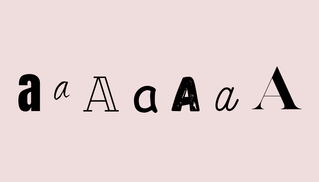
In Graphic Design For Everyone, Cath Caldwell explains how it is important to match your selected font to the mood you’d like to portray. Caldwell says, “Type is a powerful tool. Often without us noticing, it projects a mood that profoundly affects our response to the words we read.” Using the word “announcement” as an example, Caldwell shows how differently it can be perceived when different fonts are chosen.
I embarked on my own journey of selecting fonts to match a mood. When tasked with creating a mood/font demos page, I began by selecting six nouns using an online random noun generator. I looked at each noun that I chose and thought of three words that came to mind when thinking of these nouns, to determine the different moods. Then, I looked at my choices of fonts and decided which fonts matched these moods.
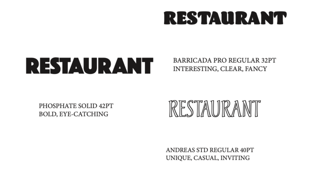
“Restaurant” is one of the nouns I chose to work with. As shown in the image above, there are a lot of different directions you can go with this. I described the Phosphate Solid font as “bold” and “eye-catching”. This is one I imagine could be used for a diner on the side of a highway. It’s classic and easy to read, something that a driver could notice and pull over to. The Barricada Pro Regular is one I would use for a restaurant on the fancier side. The serifs remind me of an upscale Italian or Mexican restaurant. Lastly, the Andreas STD Regular is one I associate with a more casual place, such as a pizza shop. It’s also important to note that in this project I often used “clear” as a descriptor for my fonts. This is because it is a necessary trait for logos to be legible.
TYPE SPECIMEN POSTER
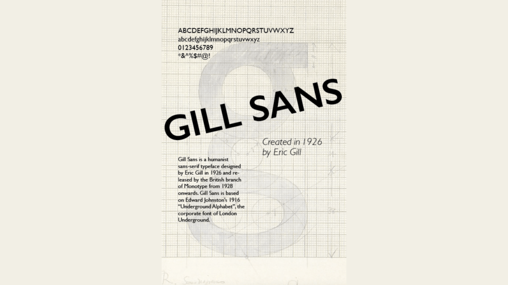
Gill Sans is a typeface I’ve noticed a lot throughout my life in passing, mostly because it has my name in the title. I decided to use the Gill Sans type family in a type specimen poster. This project is helpful to showcase a type family and its history.
BUSINESS IDENTITY SYSTEM
I created a Business Identity System for Matters Coffee, the coffee shop I previously created a brand plan for. I used the Economica type family that I selected last week when designing the shop’s logo. I used different fonts to create visuals for ways the brand can use their selected type family throughout their brand materials. This included the full menu, drink specials, a business card, and their coffee beans.
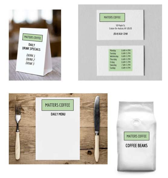
This project allowed me to see the ways that different fonts can be used from the same type family. You can keep a consistent brand across all items while not using the exact same font every time.
CONCLUSION
Overall, I enjoyed developing a better understanding of fonts and how to use them in the context of design. I’ve already noticed that I’m paying more attention to the fonts used in different logos and recognizing the mood they give. Working in social media, I know I’ll be able to apply these skills in the future.


Leave a comment